
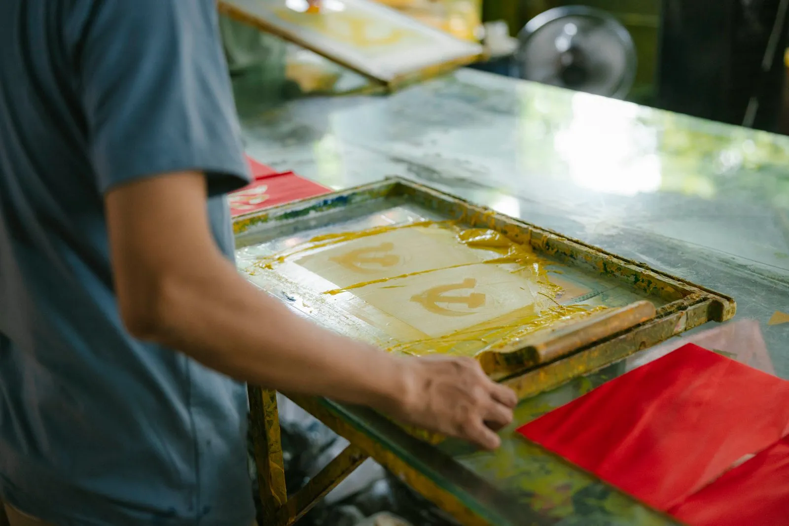
Good screen printing starts with artwork that is clear, correctly sized, and designed for the printing process. A file that looks sharp on a phone may become blurry or difficult to separate into print colors when enlarged for a shirt. Before sending your design, check its format, resolution, color setup, and placement instructions. These steps help your print shop identify issues early and produce a garment that matches your expectations.
Choose a Print-Ready File
Vector files such as AI, EPS, or SVG are often best for logos and designs made from text or clean shapes. They can be resized without becoming pixelated. A print-ready PDF may also work if it preserves vector artwork, uses embedded fonts or outlined text, and does not flatten important elements into a low-quality image.
For photographs or textured artwork, use a high-resolution raster file such as TIFF or PNG. Avoid sending screenshots, images copied from a website, or files compressed for social media. If you are unsure whether your file is suitable, send the original design file and ask the shop to confirm it before production.
Set Size and Resolution
Create raster artwork at its intended print size, commonly at 300 pixels per inch for detailed garment graphics. For example, a design intended to print 10 inches wide should be about 3,000 pixels wide at that resolution. Enlarging a small image later does not restore missing detail and can leave edges soft or visibly jagged.
Keep important lines, small text, and fine gaps large enough to hold up on fabric. Very thin strokes and tiny details can fill in or disappear during printing, especially on textured garments. Zoom in to inspect the design, then check it at actual print size rather than relying only on a close-up view.
Plan Colors for Printing
Screen printing typically uses separate screens for each ink color, so a design with fewer, clearly defined colors is easier to reproduce consistently. Tell the shop whether colors need to match a specific brand standard, and provide the reference when available. On-screen colors can look different from printed ink because displays emit light while ink sits on fabric.
Specify whether the design uses spot colors or full-color artwork, and identify any transparent areas that should show the garment color. Avoid relying on subtle gradients, shadows, or color blends without confirming the production approach. A shop may recommend adjustments, such as simplifying tones or using halftones, to make the image print cleanly.
Confirm Placement and Garment Details
State the print location in practical terms, such as left chest, full front, upper back, or sleeve. Include the intended print width or height and explain how the design should sit relative to a collar, seam, or pocket. A simple mockup can show the desired position, but include measurements so the placement is not left to interpretation.
Provide the garment style and size range, since the same print dimensions may look different on a small shirt and an oversized garment. If the design must stay centered or align with a specific feature, say so in writing. Before approving production, review a proof for spelling, color separation, size, and position.
A strong print file combines crisp artwork, manageable colors, and clear size and placement instructions. Check the design at its final dimensions, share any color-matching requirements, and review the proof before printing begins. If you need help checking a file, contact Dublin Printworks with the artwork and garment details for guidance.